Peeking Inside the Black Box: Visualizing Statistical Learning with Plots of Individual Conditional Expectation
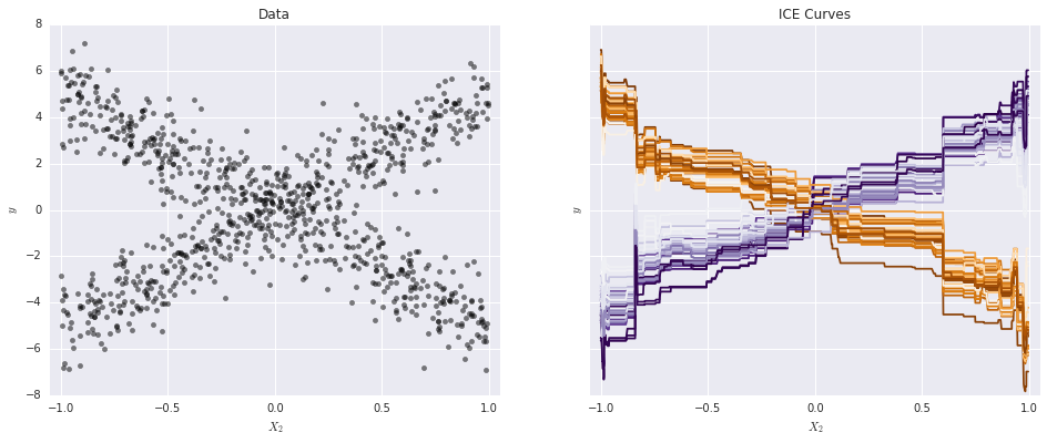
This article presents Individual Conditional Expectation (ICE) plots, a tool for visualizing the model estimated by any supervised learning algorithm. Classical partial dependence plots (PDPs) help visualize the average partial relationship between the predicted response and one or more features. In the presence of substantial interaction effects, the partial response relationship can be heterogeneous. Thus, an average curve, such as the PDP, can obfuscate the complexity of the modeled relationship. Accordingly, ICE plots refine the partial dependence plot by graphing the functional relationship between the predicted response and the feature for individual observations. Specifically, ICE plots highlight the variation in the fitted values across the range of a covariate, suggesting where and to what extent heterogeneities might exist. In addition to providing a plotting suite for exploratory analysis, we include a visual test for additive structure in the data generating model. Through simulated examples and real data sets, we demonstrate how ICE plots can shed light on estimated models in ways PDPs cannot. Procedures outlined are available in the R package ICEbox.
PDF Abstract